TL;DR Let's see the design
😬Existing Tenant Homepage 😬
🤩Revamped Tenant Homepage 🤩
Background
I joined Goodlord in February, working as the sole designer in a company of 80+ employees from the beginning. Goodlord is a SaaS property-tech company with the goal of creating the best renting experience in the world. They primarily provide software to letting agents, but also help tenants through their move in process and sell insurance products.
Goodlord provides a web application for agents to manage their tenancies, and tenants to complete their move in steps (referencing, document signing) on. My role was to work with Product Managers on the different streams (reducing support tickets, revenue etc.), working through the end-to-end design process for multiple projects.
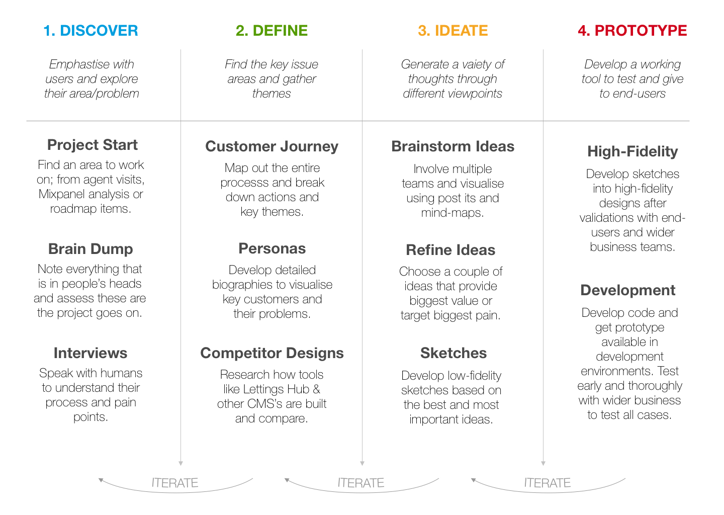
Once again, my Design Thinking Process, adapted from my previous project, and showing a more general set of steps. This emphasises the human using the product, which is easy to forget.
Initial Research and Contextual Inquiry
While projects owned by Product Managers are driven from company objectives, this project came to fruition through my research on the current state of the platform. This was a big plus for me as a designer, as I was able to influence our company strategy, through strong research.
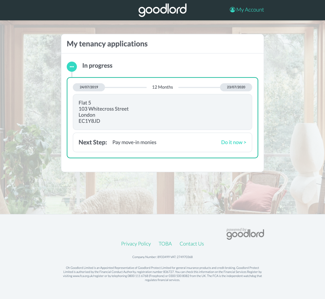
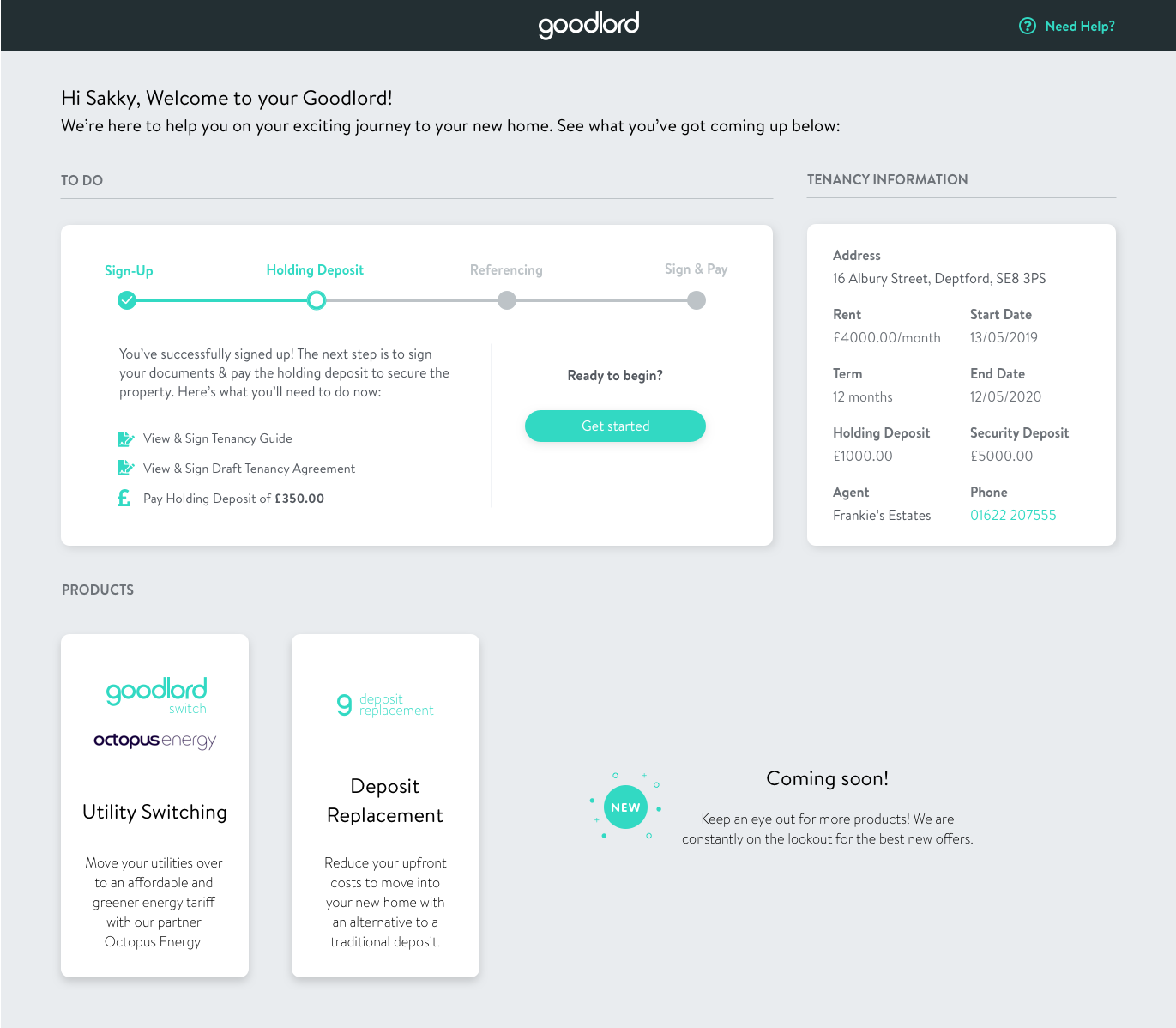
Our mission statement is to create the best renting experience in the world and naturally I looked at the tenant journey with our platform, which was not the best. Below is what the homepage looked like when a tenant was due to take an action at any point in their journey.
The unique thing within this project was that I, like many of my colleagues at Goodlord, were tenants. This meant that putting myself in the shoes of the human on the other side of the product was a little easier, as I’m able to compare it to my rental experiences.** This being more qualitative research, was combined with quantitative research, by looking at the amount of support tickets produced by the tenant homepage. As tenants account for 30% of total support tickets, and with over 10% of tenant tickets relating to tenant portal, it made it clear that this was something that needed improvement.
**While having my own rental experience is useful, I made sure to use an array of experiences to ensure that the wide range of experiences that people have while renting were considered.
After identifying the tenant portal as an area for improvement, I began getting other colleagues thoughts on the area, this was the Brain Dump stage, and you can view an example of the output of a session with a Customer Success manager here.
I then conducted contextual inquiry sessions with new joiners of the company. This was a fantastic way to get feedback on the intuitiveness and the experience of the existing tenant journey, through the eyes of people who had never seen it before, and had experiences of renting already. You can find the outcome of these here.
Tenant Journey Mapping
After the initial research, and the journey run-throughs with new starters, I began to map out the customer journey. This detailed the experiences for the tenant, using Goodlord while renting a property. Detailing the feelings and thoughts during each stage helped to identify key pain points and bucket themes that came from the initial research.
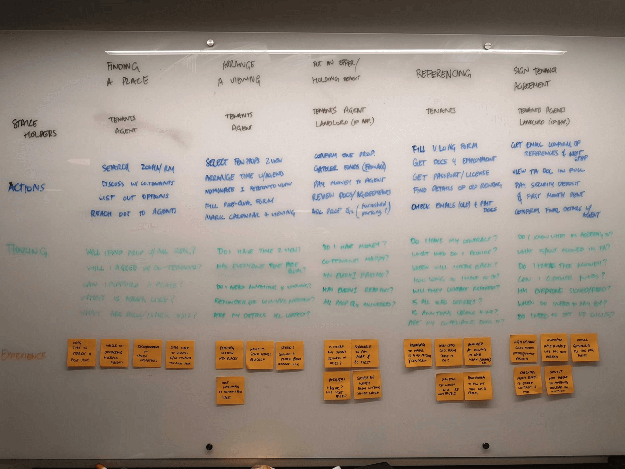
To take the Holding Deposit stage for example, this can be a crucial time in the journey for the tenant, as they would want to secure the property as soon as possible, as to avoid it being offered to another person. And as they are focused on paying their deposit, it may not be the best time to bombard them with products and offers.
This was a common theme throughout the different stages, the whole renting experience can be a very stressful one, and as a result, we thought we could position Goodlord as point of guidance and reassurance, to give visibility of the entire process and offer benefits throughout, but non-intrusively.
Due to the fact that many of us were tenants, I skipped through Personas for this particular project, as it wasn't as important to develop empathy in a situation where we all could be the actual end-users for this project.
Competitors
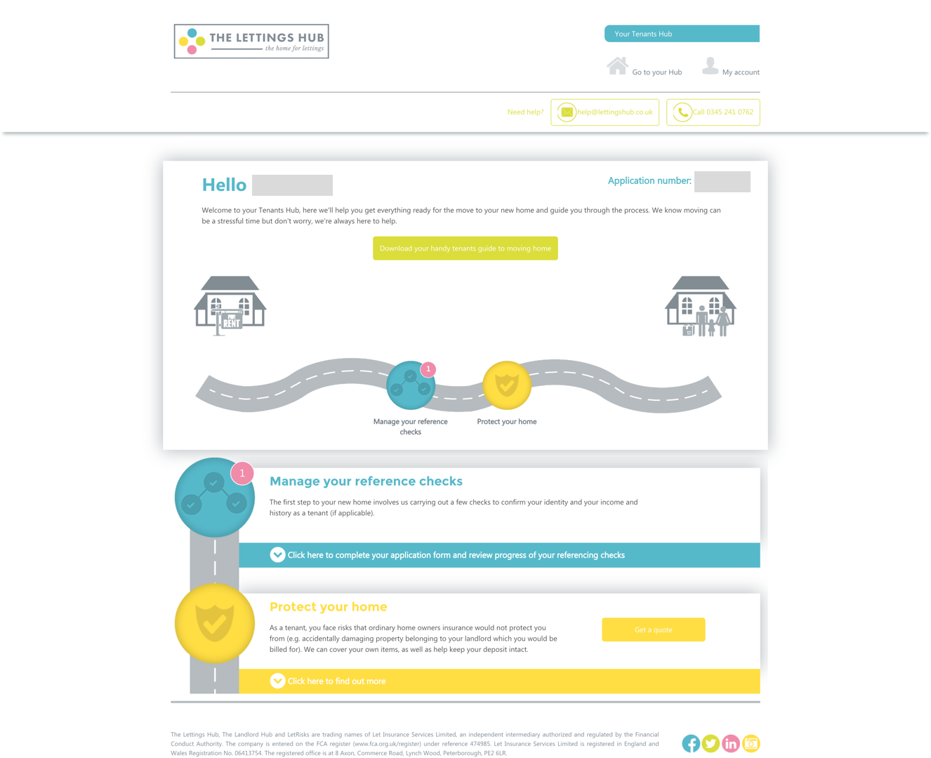
There are quite a few competitors in the prop-tech space for Goodlord, namely Teclet as a direct competitor and LettingsHub as a referencing alternative. I was fortunate enough to go through a real referencing process for the LettingsHub while moving flats and below is a screenshot of their tenant portal.
Converge & Diverge with Brainstorms
After this, I moved onto the ideation phase, specifically starting with converging. I facilitated brainstorms with different departments within the business: Customer Success, Support and Product. This helped to get everyone’s views on what the ideal experiences could look like, what would we want if we were moving properties. We noted down everyone’s thoughts (link) and took away some key themes:
I then began to sketch out some ideas of what the tenant homepage could look like. Below is a sketch that shows the different stages of the journey (giving visibility), marketing of products (revenue opportunity) and upload of documents (contributor to a large percentage of support tickets).
This sketch addressed a few of the key themes that were found in brainstorms. From a technical standpoint, the feasibility of the design, even at this early stage, was discussed with developers. Getting an understanding of our technical limitations, specifically our back-end architecture was crucial to developing what a first iteration (v1) could look like and feature.
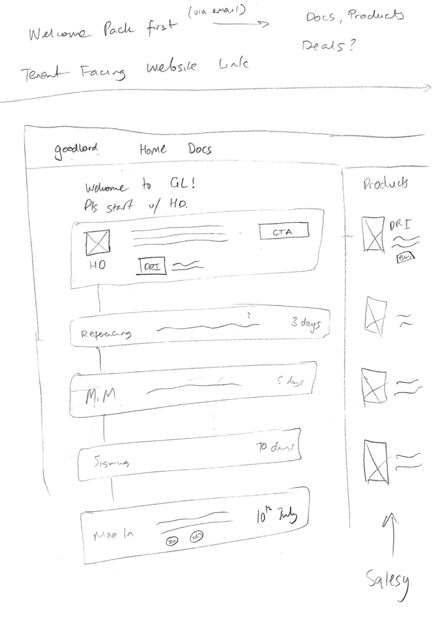
More sketches were done (click on the image and go through the artboards), and I used our very collaborative kitchen space to do some guerilla testing, getting feedback from my colleagues on what they thought about certain layouts and designs.
High Fidelity and Slack Polls
After developing out sketches and using all of the research that had been gathered, I began on the high fidelity mockups for the tenant homepage. As we had a few good ideas on what should be included in the homepage, I had a few different options for mockups, below are 4 different designs that were created.
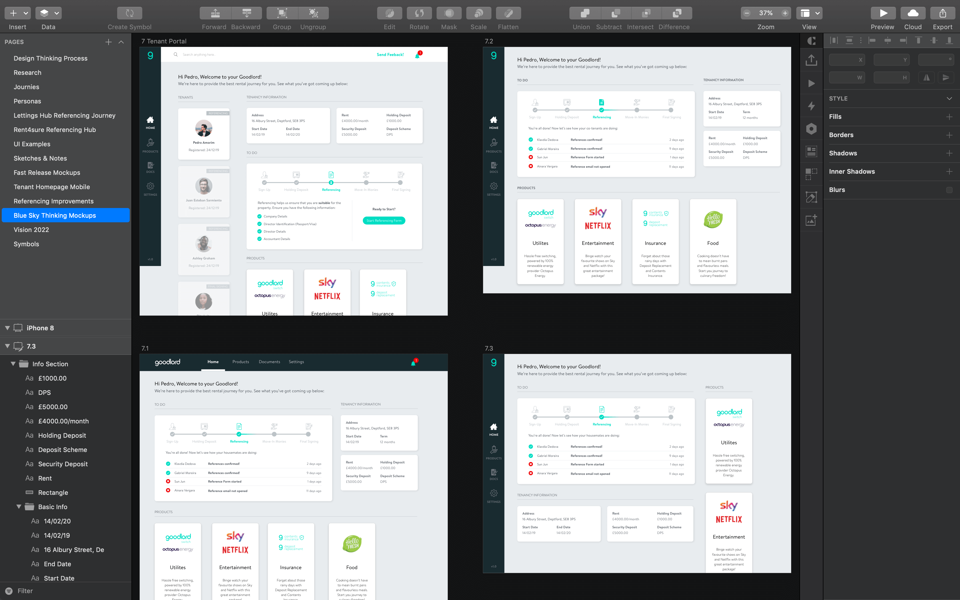
As Goodlord had a lot of employees that were tenants, getting their feedback became even more useful. I created a feedback channel on Slack, where I would post polls to get their thoughts and votes on designs. To reduce bias in the polls, the existing votes were not displayed to the voters, and were only announced at the end.
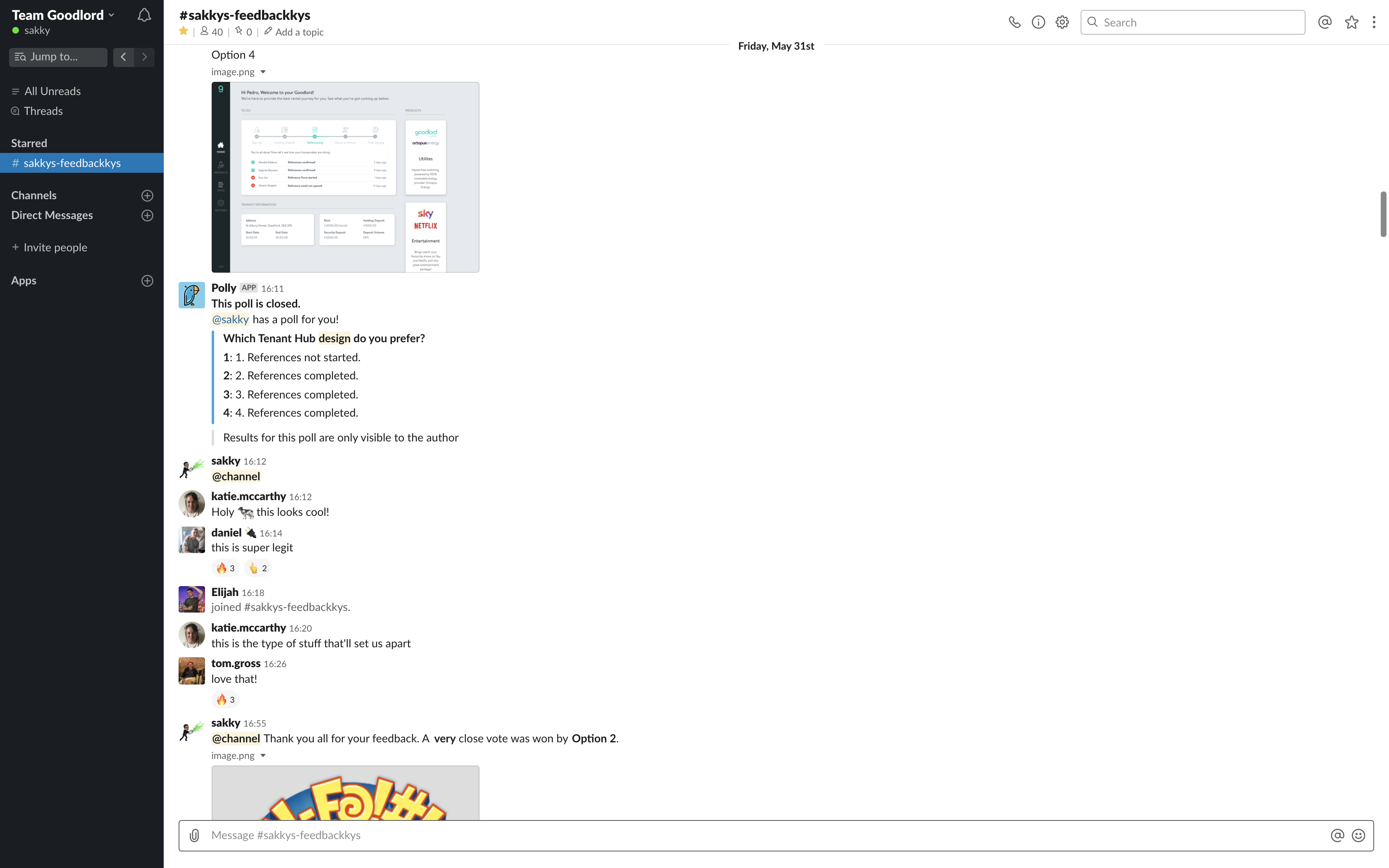
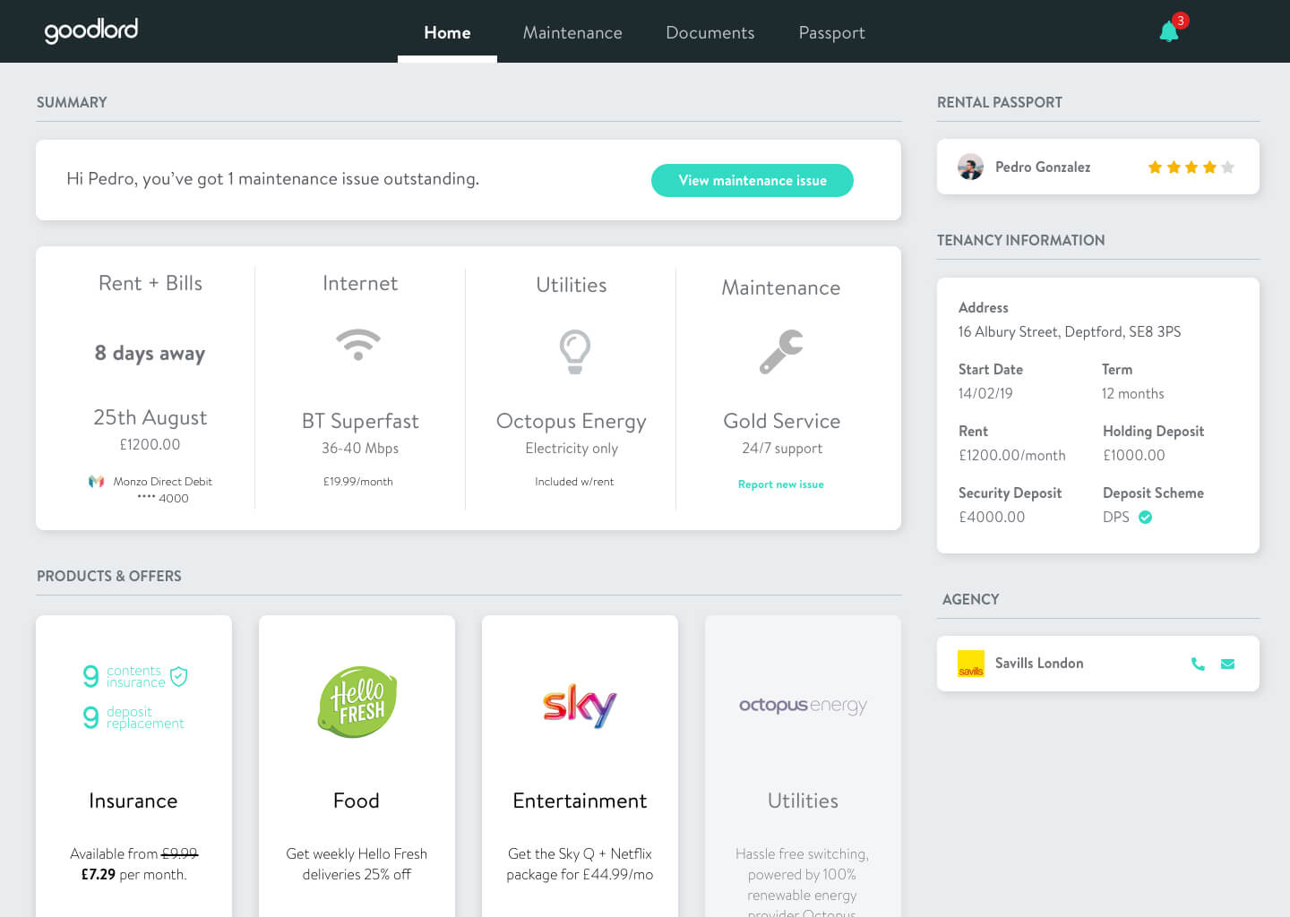
The design that won the most votes was Option 2, which shows what a tenant would see when going through referencing. The design has a navigation menu to the left (including those dreaded document uploads), products on the bottom, and key tenancy information on the right of the homepage. The most important thing for a tenant (and agent and therefore Goodlord) is to ensure that all the stages/steps are completed as quickly as possible.

This is the reason why the visibility of the different stages of the timeline and the stages of the co-tenants are so important to helping complete the stages as quickly as possible. Timelines and progress bars in general give users an easy way to understand where they are in the entire process and see how far they have to go.
Mobile Prototypes
While the desktop designs were in a good position for the first design iteration, I looked at the data behind our current tenant homepage usage. Using Mixpanel, I looked at the device breakdown for key web pages on the tenant journey; these included the Homepage and Referencing screens. Note: “undefined” means desktop users
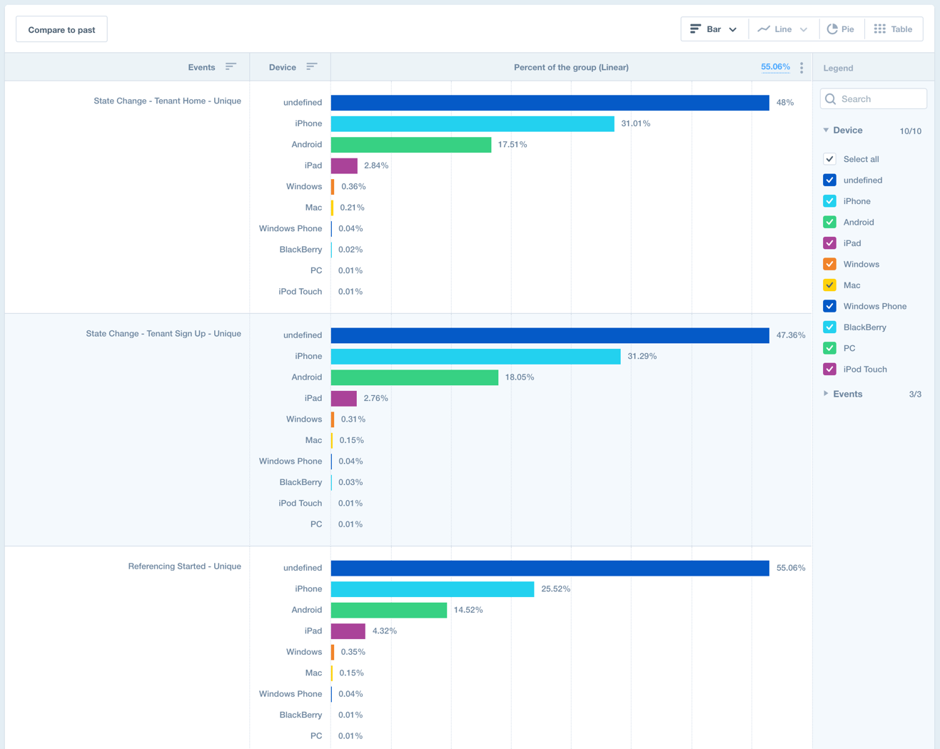
We can see that there is a even mix of desktop and mobile users, so I began working on what a mobile experience could look like. This was done using Adobe XD, and below is an example of an interaction for the tenant homepage on mobile. View the prototype here.

Lean Methodology
As this became the first design iteration, myself and the Product Managers began working together on a feasible MVP. As the tenant homepage was not part of the product that had been researched heavily or invested in, there were unknowns around its benefits. Below are a few of the questions we wanted answering:
To focus on answering some of these questions, and to reduce the build/development effort required to release an improved tenant homepage, we worked on stripping back the first iteration. This meant looking at what was technically most-challenging and assigning it for a future iteration, once some of our initial questions had been answered, and it made sense to make a large investment in the project.
The lean Version 1 of the design was then iterated on further to make more layout related changes, focusing on a fresher, revamped UI. A tenant homepage that would offer tenants the visibility they required first and foremost, the most pressing of all issues that was uncovered through all the research. The mockup below shows the Version 1 that is as of early-September, being reviewed under its technical acceptance criteria.
This mockup is a short-term and lean view on the homepage, the picture at the top of this page is more of a long-term blue-sky mockup for what a tenant homepage could be.